
I would like to think I’m a pretty big Olympics fanatic, but what really struck me (amid all the controversy and the stories of Rio being ill prepared) was how well the 2016 logo was designed. Even more interesting is the logo’s origin and the design firm Tatil Design (a local design firm located in Brazil). It seems like the process of creating a logo that will be seen by billions of people is an Olympic event in-and-of-itself, the Olympic Committee chooses a complete design with a lot of other folks competing for the logo bid. The results of Tatil’s hard work is a great design that works both in 2D and 3D applications. I love the foresight and the story of how the logo was created.
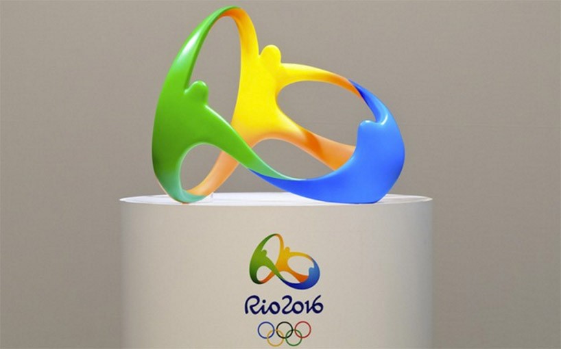
When I first saw the Olympic logo, I really could see the letters: ”R”, “I”, and “O” within the logo, and I had sought out information on if this was part of the inspiration…. Unfortunately it does not seem like it was intentional, but the logo’s intent was to capture how Brazil’s energy and how it’s people receive others. The colors are representative of the nearby forrest (green), inspiring ocean (blue), and their warm climate (orange/yellow). The figures, arranged in an infinity shape, have such movement and joy to them. Overall, probably one of the more memorable logos (in my lifetime) in my opinion.
Here are are the logos from 1932 to 2016: https://www.pinterest.com/pin/227150374926498784/
The Olympics also created their own font!!! So much time and thought into something that will be used on a lot of things, but just for a short span of time, on an occasion that only comes four years at a time. I think that is what makes the Olympics so special. Athletes must be prepared to perform on the world’s stage and it feels like the world isn’t as “big” as it usually is. If we can come together, forget our differences, and compete in the highest levels of sport, I would think humanity can accomplish anything.
With these the Opening Ceremonies quickly approaching on Friday, these two weeks of sports and games, I hope, don’t not pass by too quickly.
References Article: http://99u.com/articles/53580/how-the-2016-olympic-logo-and-font-were-created
Stay In Touch